Sneak Peek Behind the Scenes: Reno Project
I’ve come to learn that there are a lot of similarities between creating a book and renovating a space. Both of them are journeys that you don’t take lightly. There are twists and turns along the way. There are challenges and triumphs. And at the end of it, you almost forget all of it, and are ready to jump into the deep end again.
What I’ve also learnt is that the work of both of them has to fit in around everything else that’s going on in your life. One minute you’re driving your child to school camp and the next minute you are answering a series of questions from your carpenter, the electrician…
But the challenge is what makes it fun and engaging, if you choose to see it that way.
Due to global material and local labour shortages this whole renovation has been much more protracted than what we expected. We’ve had the keys for almost a year and thought we would be in the space about six months ago.
This is not a complaint, though. It has been worth the wait. Working with a builder and team that bring good energy to the site is essential. Good people are worth waiting for.
I’m always fascinated to see how spaces come to life.
If you are too, here are some progress pics of the space. Eventually it will be a retail shop, showroom, design studio and warehouse for Imprint House. And it will all be beautiful!
Feature Wall
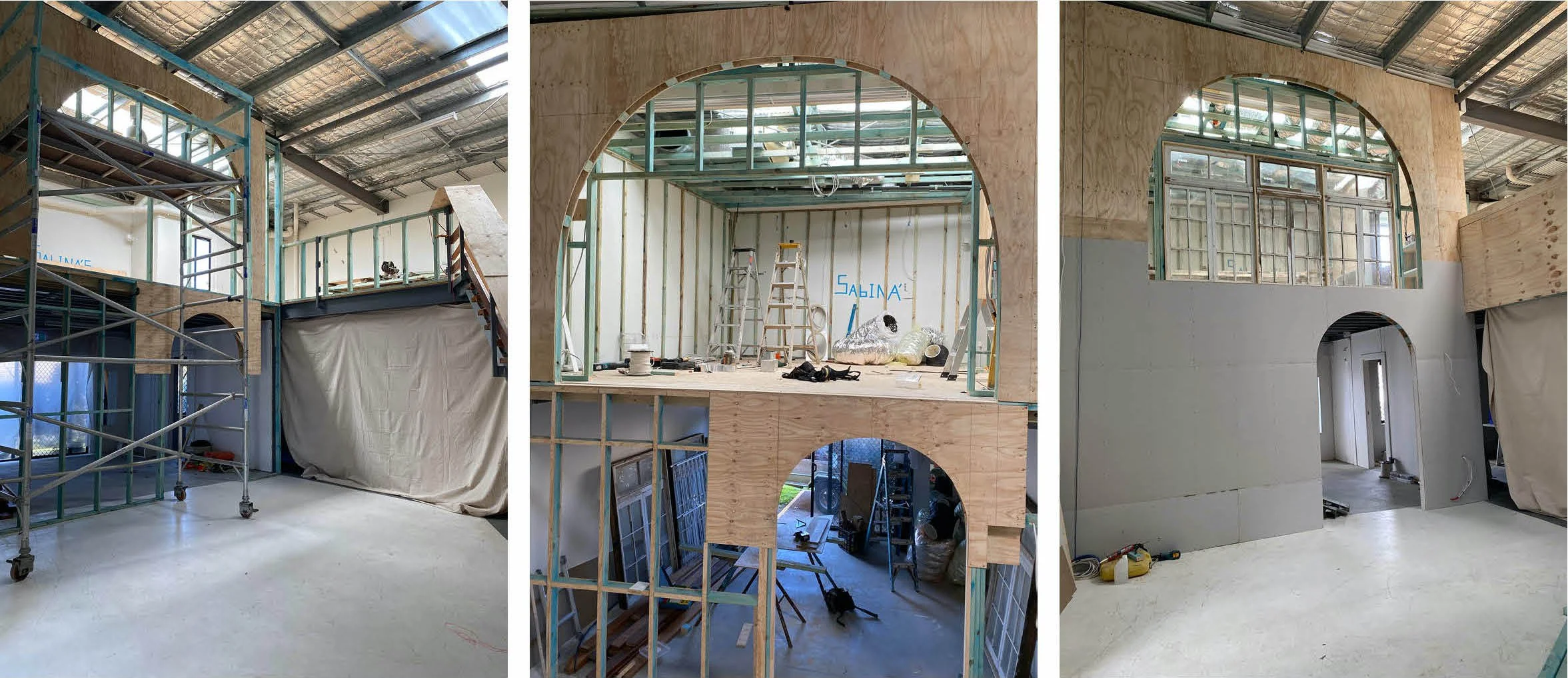
I often find that the features you like the least end up being the ones that push you creatively and force you to dig deep and devise a solution that’s original and hopefully inspiring. The mezzanine, which will house an office for the design studio needed to be private yet let light in. The solution was to design a feature wall that incorporated salvaged windows. This is the first space you see when you walk into the building, and it needed to set the tone for the whole space.
Staircase
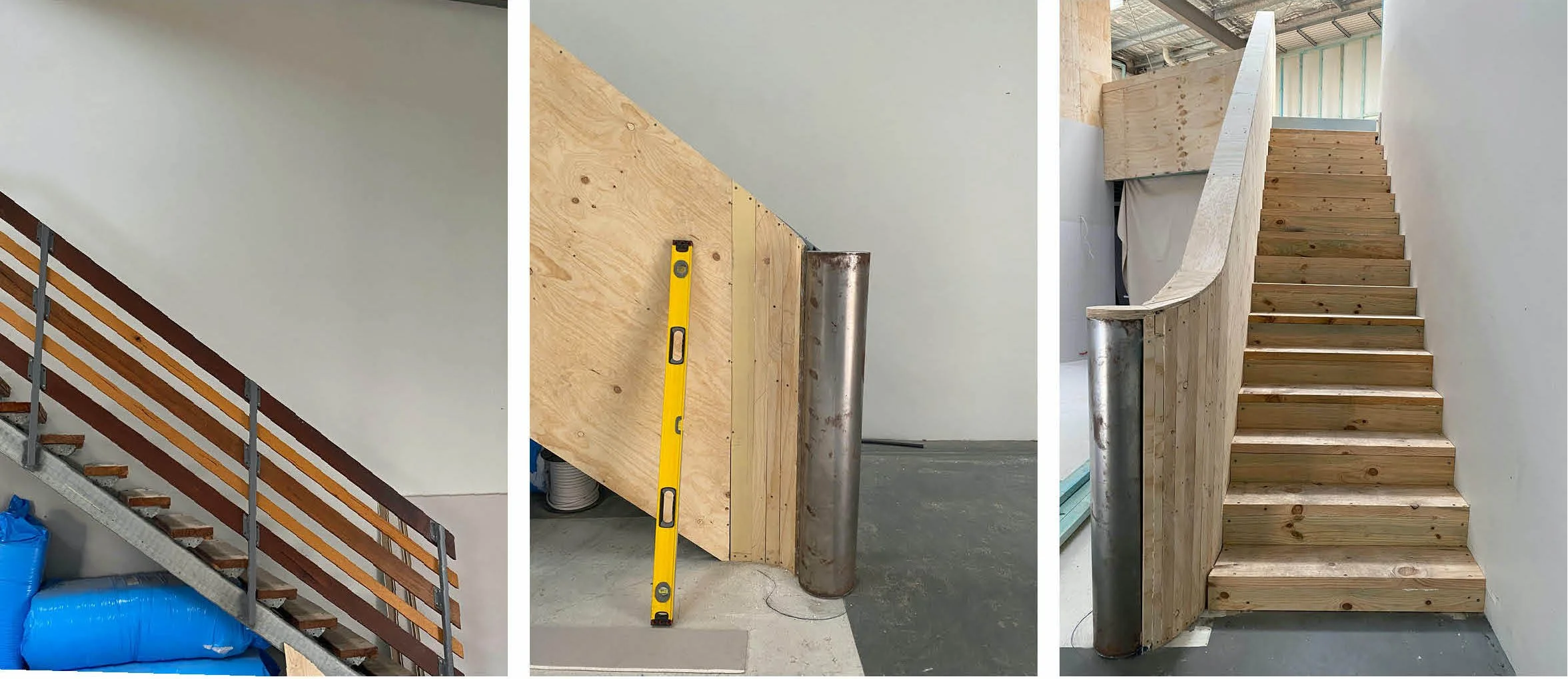
Another challenging area. The existing timber staircase not only wasn’t visually appealing, but it was noisy! After exploring ideas to keep the shell and recover the steps and handrail, we decided to remove them altogether (and sell on Facebook Marketplace) and replace with a solid timber staircase which we will cover in the next stage. To keep the soft curved lines flowing from the feature wall, we designed a curved staircase end, which will be plastered for a soft finish.
Office Entrance
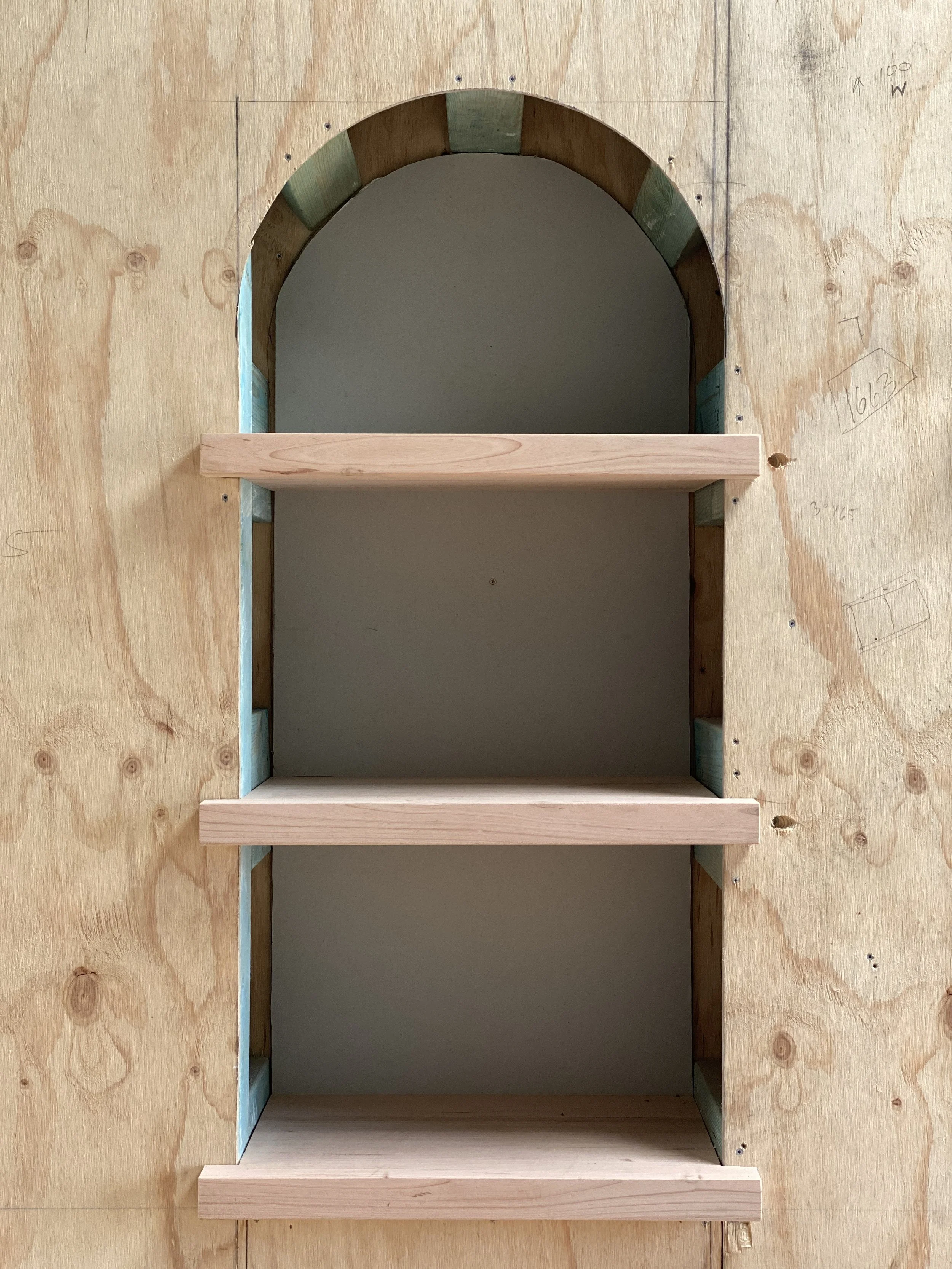
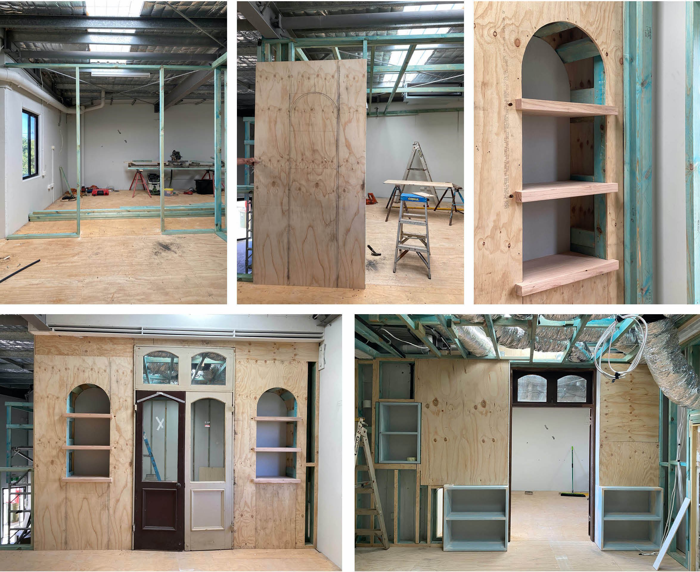
Creating a sound-proof office for the design studio was essential, but it was important to consider the connection point with the retail showroom. Also, making the most of every area was important too. The solution was to design shelf cubbies that could display products, and on the flip side allows space to create shelving within the office itself. I’m always looking for ways to maximise storage, but in an intentional way.


